Improving our referral program
Case Study
Project overview
The situation:
The value proposition of the referral program is that if a customer refers a friend and this friend signs up to bloomon, the bloomon customer receives credit for a free bouquet (of any size and it could also be a give-away bouquet) and her friend receives a free vase within her first delivery. The referral program is very important for Bloomon to get more customers.
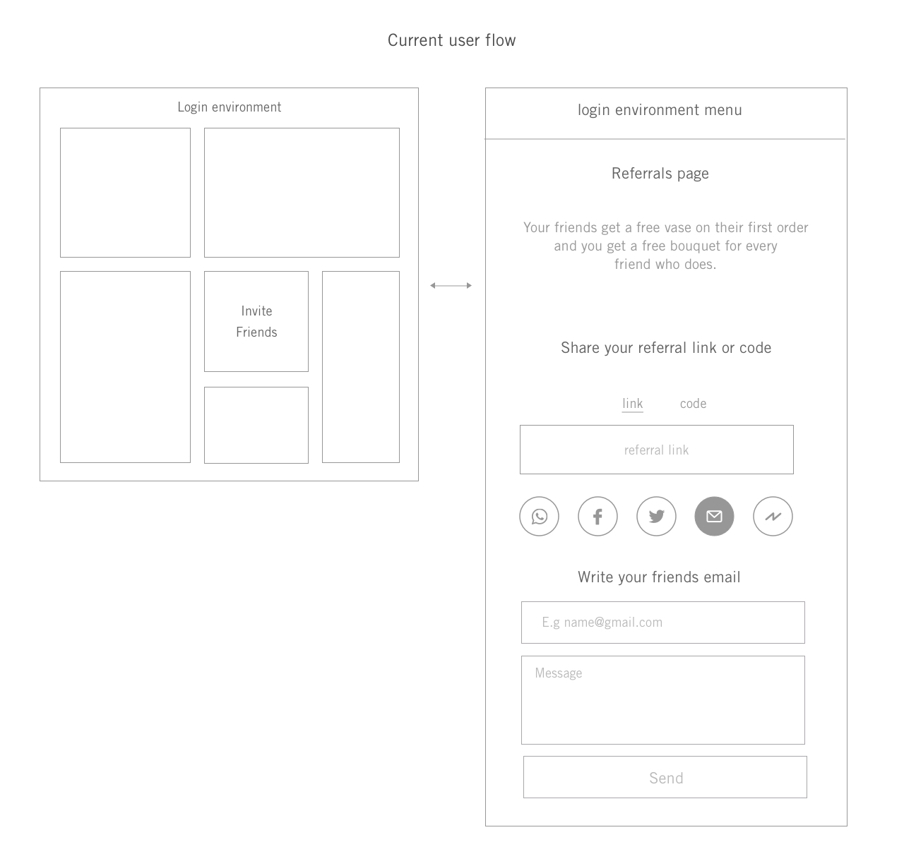
Regarding the design, they have a referrals pop-up in the login environment which includes the referral link and the referral methods.
This is the current user flow:
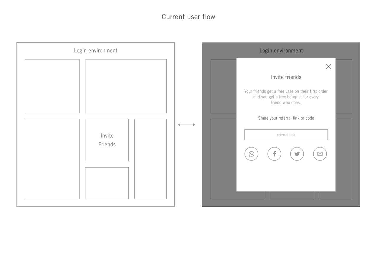
Current user flow
This is our current UI design:
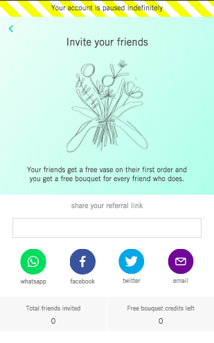
Mobile UI Design
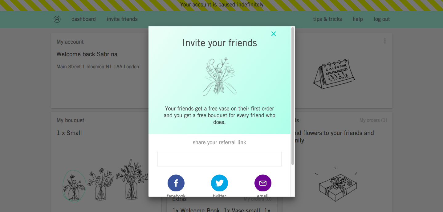
Desktop UI Design
The challenge:
Bloomon is having a referral low rate which is below their target. Especially the number of times a customer uses the referral program.
The main goal is to find out why their customers only use the referral program within the first two deliveries and figure out how to get more referrals in other stages of the customer journey as well.
My target audience:
Active customers who have received at least 5 deliveries and have used the referral program only before their second delivery, but not after their second delivery.
The user research:
I was the UX/UI designer responsible in the referral squad and I was working with people from the growth, marketing and sales team.
For this particular project, I started conducting a UX research, I made a UX research plan which consisted of interviewing customers by phone with the goal of understanding their motivation to refer our product, how they refer a friend and if they were having any problems while referring bloomon to a friend. After that, I conducted two usability tests to validate the different solutions.
Customer’s interviews:
Some of the questions that I asked are the following:
- Are you aware of our referral program?
- Have you used it?
- Who you have recommended bloomon?
- Why didn’t you use it since then?
- How satisfied or dissatisfied are you with our referral program? Why?
- Is there any frustrating feature in our referral program?
- How easy to use did you find our referral program? Why?
- How likely is it that you will use it again?
- Is there anything that you wish our referral program will allow you to do that it doesn't allow now?
- Do you have any suggestion to improve the referral program?
Apart from this, I also conducted some guerilla usability testing on the streets to identify possible UI flaws that could prevent users from referring bloomon.
The findings:
8/9 bloomon customers refer a friend in face-to-face conversations.
7/9 bloomon customers think that referring a friend is too much effort, compared to the benefit they obtain.
9/9 of bloomon customers refer bloomon to close friends or family and to people that are true flower lovers.
6/9 of bloomon customers didn’t know the value proposition of our referral program.
The findings of the usability test were that the tweet exceed the 120 characters so it wasn’t possible to publish it, 90% of users didn’t see the total number of friends invited and the total of bouquet credits as nobody scrolled in the pop-up, the phrase “invite friends” it’s confusing for some users, they were looking for “share with a friend” so they had a hard time in finding the referral pop-up and 80% of users suggested that they would like to have WhatsApp or Telegram to share it with a friend.
Design goals:
Based on the user research insights I defined the following design goals together with my team:
Bloomon customers have to understand how the referral program works and the value proposition.
The process of inviting friends has to be clear and easy to do.
Increase the number of referrals by 10%.
Ideation phase
First I conducted a competitive analysis, I analised how other famous companies do it and what referral programs convert the most:
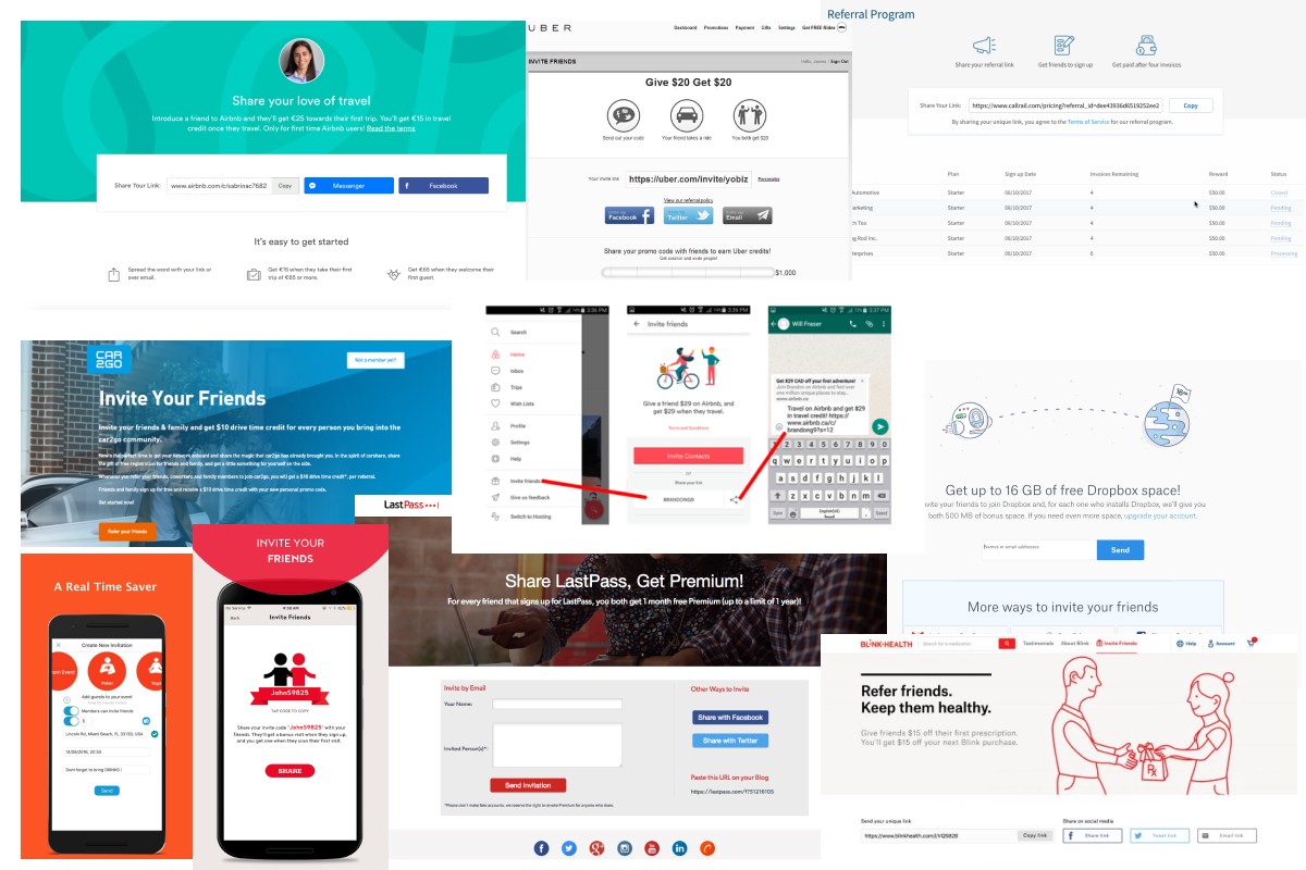
Competitive analysis
Then based on the user research insights and the customer analysis we decided to include the following features in our referral program:
- We are going to give the opportunity to use the referral link and we're going to introduce referral personal code which will be easier to remember and perfect for face-to-face conversations. We have decided this because for now, we can't remove the referral link as some of our customers are used to it and there are some active links. Plus, in some cases, our customers would prefer the referral link instead of the referral code, for example, if they share our product via Whatsapp or facebook messenger. The referral code is better for in-person conversations.
- A “how it works” section. One specific section explaining how the referral link works and how the referrals code works.
- Add the “copy” button to easy and fast copy the referral link.
- Add Facebook messenger as a referral method.
We explored very different ideas for the invite friends page and also for how to explain how the referral program works in a very clear and concise way. This a glimpse of that process:
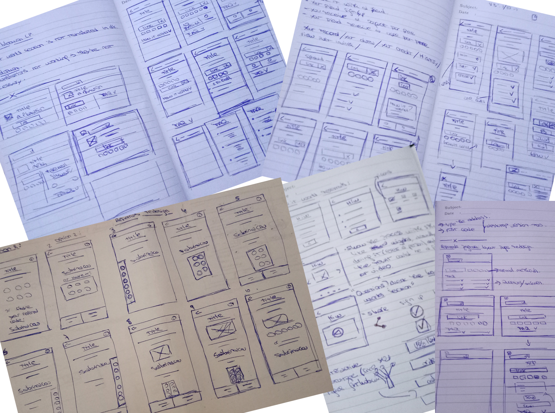
Sketches 1
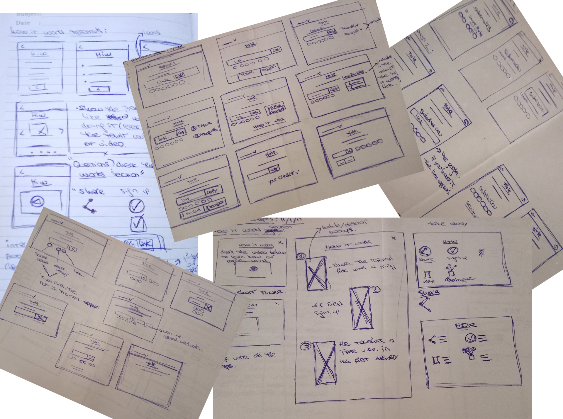
Sketches 2
Validating the concepts:
Once we had clear concepts that could be a solution I designed high-fidelity prototypes and prepared some guerrilla user tests.
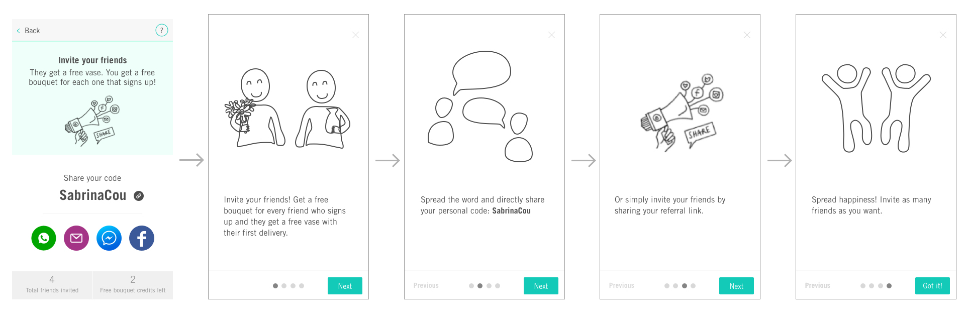
First usability test:
I tested the following design on the streets, public transport and supermarkets with 8 users:
First concept
After conducting the usability tests on the streets we found out the following:
8/8 participants didn’t really read the text on the wizard, they just clicked on “next” as fast as they could. So in the end, they didn’t know how the referral program works.
8/8 participants focused the attention on the icons.
5/8 participants didn’t understand the email icon, some of them thought that it was for SMS.
8/8 participants remembered the link but not the code.
8/8 participants didn’t read the text on the main page.
Based on these insights I made some changes on the prototype: I included a title on the how it works section which explains the key message, I included the link button in the sharing methods and I modified the email icon, plus I translated the prototype into Dutch.
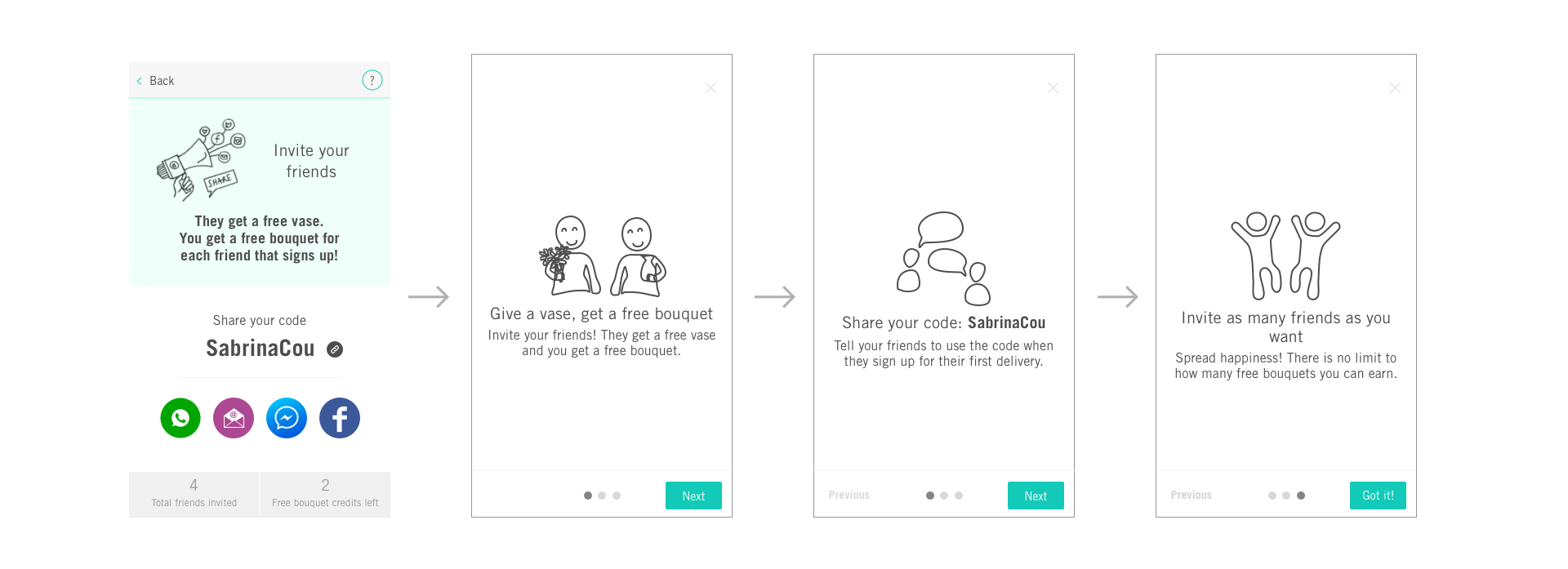
Second usability test:
I tested the following prototype on the streets, public transportation and supermarkets with 5 users:
Second concept
The conclusions that we got after conducting the usability test are the following:
4/4 participants understood better the message in Dutch, which means the mother tongue is very important.
4/4 participants understood the value proposition (free bouquet — free vase)
2/4 participants didn’t understand the email icon.
4/4 participants remembered better the whole message on the three steps version of the wizard.
The solution:
Based on all the feedback that we collected throughout the project, we decided to develop the following solution:
- The pop-up will be opened by default the first time the user visits the referral page.
- We only use Whatsapp, FB messenger, email and FB as sharing methods. 3 out of 4 are direct sharing which are the most prefered by our clients and the ones that drive a better conversion rate.
New user flow
Compared to the current solution, we deleted Twitter because we figure out from the data that almost nobody uses it and we include Facebook Messenger because from the user research insights we can say that bloomon customers prefer to refer close friends or family instead of massive sharing the product.
The takeaways
My personal takeaways of this projects are:
Always test with at least three people your designs: I was very surprised to find out that most of the people didn’t understand the email icon. Also to find out that most people didn’t remember the value proposition in the previous concepts and we had to design different concepts until we found the best solution.
Mother tongue is important: Here in NL almost everybody speaks English fluently, especially in Amsterdam, so I didn’t think that Dutch version would increase the understanding of the message, but it did!