Wizard-calendar
UI design
Project overview
The situation:
Bloomon is an online service subscription for flowers. We deliver bouquets to our customer's doors with three different frequencies, weekly, bi-weekly and monthly.
Currently, we have on our login environment a calendar that allows the customer to manage their deliveries. They can skip or add new deliveries whenever they want. Plus, we also have an option to change the frequency.
The problem:
A big number of our customers were changing their frequency subscription to monthly right after signing up for our service. However, some of them came back to the bi-weekly subscription after a few weeks. This could mean that our customers changed their frequency when they wanted to skip a delivery because they didn't know how to manage the deliveries on the calendar.
Besides, this is a problem because we would like to encourage the bi-weekly subscription.
The goal:
Decrease the number of customers that change their subscription to monthly by 10% and understand why they were changing their frequencies.
My Role:
UX/UI designer.
The approach:
During this project, I worked with another UX designer and with developers. As we weren't sure the reason why our customers were changing their subscription to monthly we designed two different concepts.
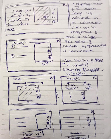
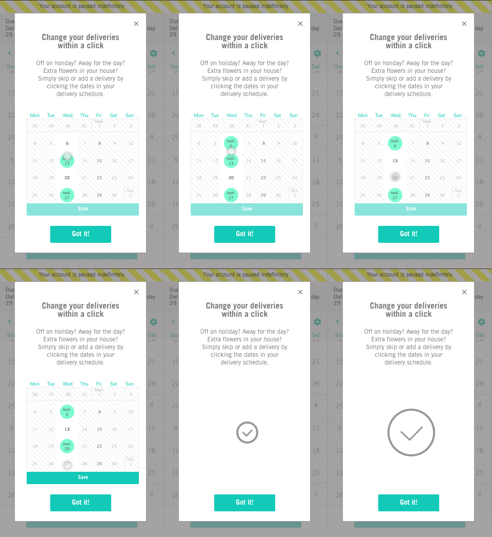
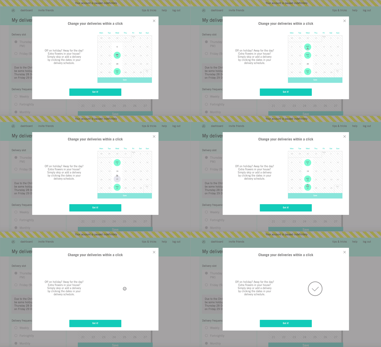
My solution was to design a calendar-wizard that explains very clearly to our customers how to skip deliveries in the calendar without the necessity of changing the frequency. This calendar-wizard will be on the delivery page and it will appear as a pop-up the first time that our customers enter on this page.
My colleague's idea was a pop-up that explains to our customers that we change the bouquet style and design in each delivery, so if they change their delivery to monthly there will be a lot of designs that they will miss. This pop-up will appear when a customer changes their frequency to monthly.
The solution:
Once we had both solutions designed and developed we set up an A/B test that ran for 3 weeks.
The results of the test show that both solutions helped to decrease the number of customers that change their frequency to monthly but the calendar-wizard was the best one.
So, our conclusions are that most of our customers don't know how to skip and add deliveries without changing the subscription and that is why they were changing their subscription to monthly.
Now that we know this, we will improve the design of the calendar-wizard to inform our customers even better.

First sketches and ideas

Mobile wizard calendar

Desktop wizard calendar
