Bloomon · Product design
Reducing friction without breaking fulfilment
I led the UX and UI design of a new address lookup experience for the UK and the Netherlands, reducing customer effort while making addresses more reliable for fulfilment operations.
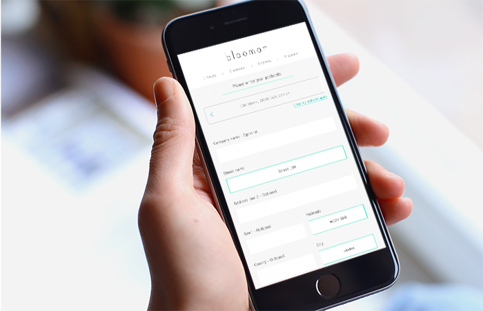
A note on the visual system This project was designed in 2017 within bloomon’s brand system. Looking back with today’s accessibility standards, I would revisit the colour contrast, typography, focus states and error communication. The process and product decisions remain representative of my work at the time; the visual system should not be read as a current accessibility reference.
The challenge behind a simple form
At Bloomon, customers had to manually enter their address when subscribing. It created unnecessary effort for customers and introduced another problem downstream: incorrectly formatted addresses could create issues for the Logistics team responsible for getting flowers to the right place.
What looked like a simple form-design problem was actually a challenge spanning customer experience, technical constraints and fulfilment operations.
Entering an address seems straightforward until you try to design one experience that needs to work reliably across different countries, address structures and customer behaviours.
The core challenge
Find the right balance between reducing customer effort and maintaining enough control to ensure address accuracy.
01. Understand the problem beyond the interface
I started by looking beyond the subscription form itself. Working with Logistics helped us understand what happened after a customer entered their address and where incorrect or inconsistent information created problems downstream.
At the same time, we had to account for an important constraint: addresses don't work the same way in every market. The UK and Netherlands have different address structures and postcode behaviours, which meant simply creating one universal interaction wasn't necessarily the right answer.
This shifted the project from “How can we make this form quicker?” to “How can we reduce effort while still collecting the information the business needs to fulfil an order reliably?”
02. Design for when things don't go to plan
The happy path was relatively straightforward:
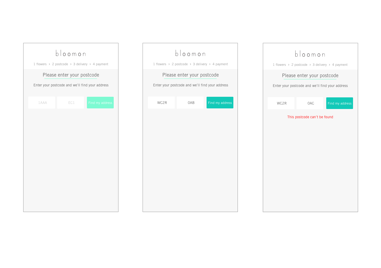
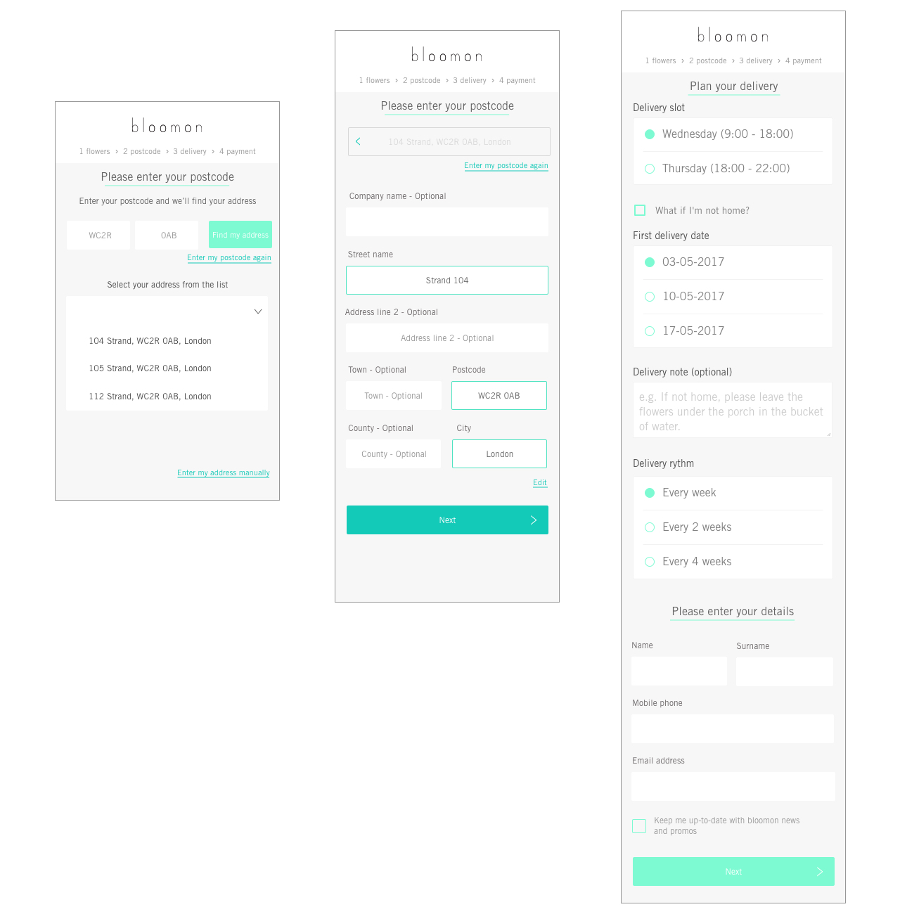
Enter postcode → Find address → Select address → Continue
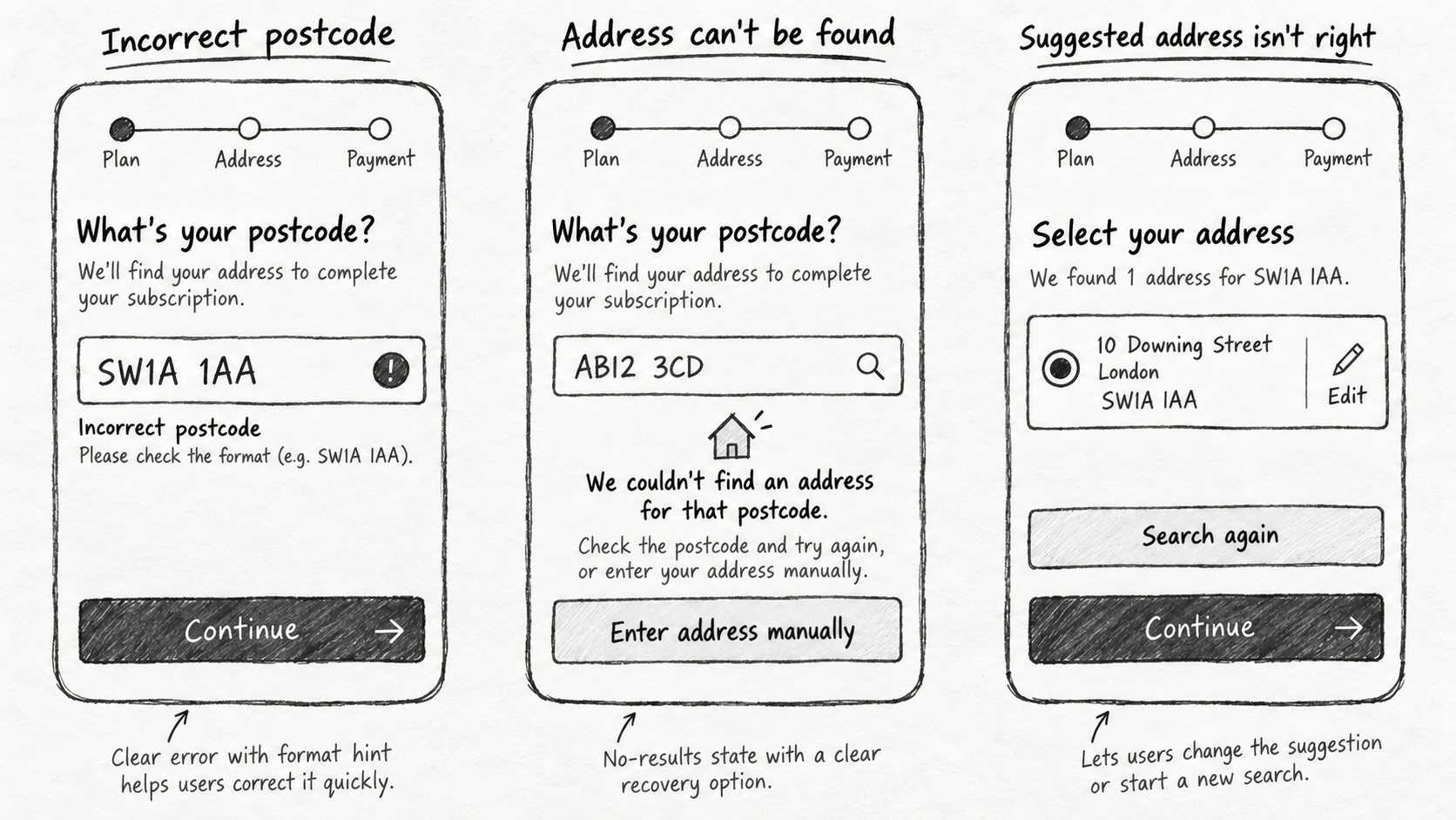
The more interesting design challenge was everything around it. What happens when the postcode is incorrect? The address can't be found? Several addresses match? The suggested address isn't quite right? The customer needs to enter an address manually?
Rather than treating these as exceptions to solve later, I designed them as part of the core experience. This helped us create an experience that remained simple when the lookup worked, without trapping customers when it didn't.
03. More flexibility wasn't necessarily better UX
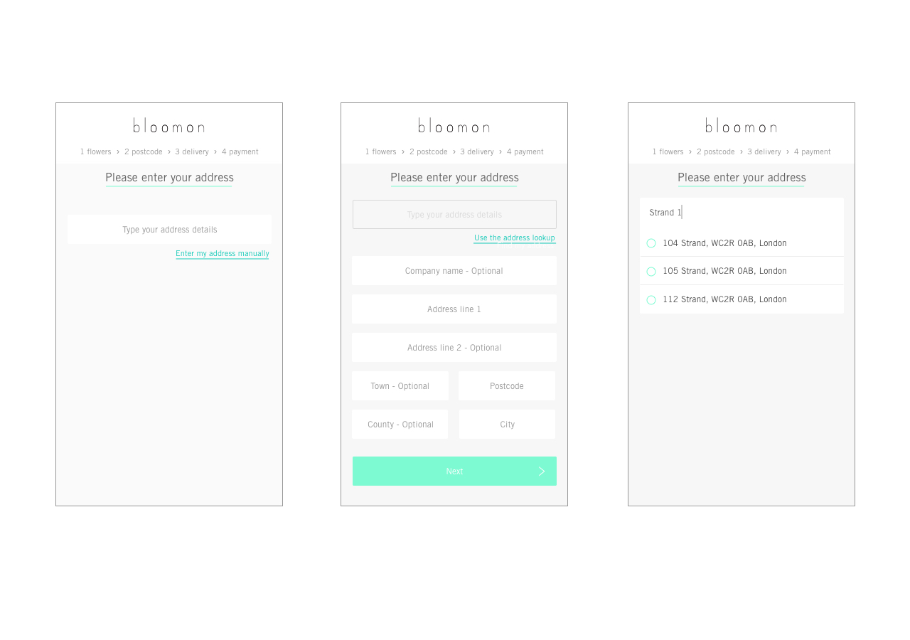
We explored a flexible search experience where customers could begin with different pieces of address information. It initially felt like the more customer-friendly approach, but that flexibility introduced significantly more complexity: more possible inputs meant more ambiguity, more states to account for and less predictable results.
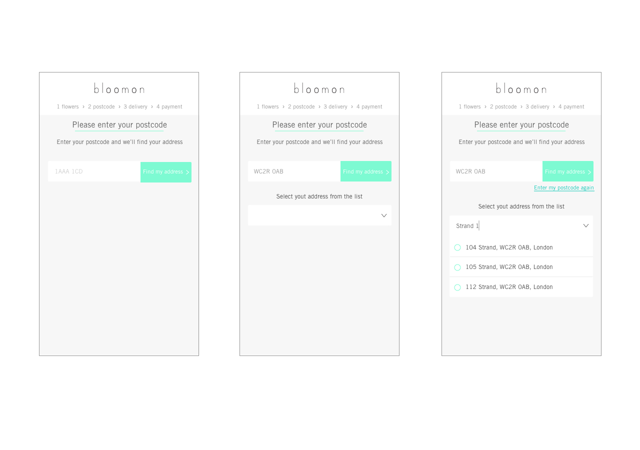
A postcode-first approach was more constrained, but it gave customers a clearer starting point and allowed the system to progressively reveal the information needed to complete their address.
The constraint actually made the experience simpler.
04. One principle, adapted to two markets
Instead of forcing an identical interaction across the UK and Netherlands, I designed around a shared principle:
Ask customers for the minimum information needed to reliably identify their address.
How we applied that principle could then adapt to the structure of each market. This gave us consistency in the experience philosophy without assuming consistency in the underlying data.
This became one of the most useful lessons from the project: scalable design doesn't always mean identical design.
05. Validate it in the real journey
Once we'd refined the interaction through usability testing, I designed the final experience and worked with Engineering to prepare it for experimentation.
Rather than evaluating the address lookup in isolation, we tested it within the actual subscription journey. The new experience was evaluated through a three-week A/B test and subsequently rolled out to customers.
Outcome
What I'll carry forward
This project changed how I think about seemingly simple product problems.
Address entry wasn't really a form-design challenge. It sat at the intersection of customer experience, technical constraints and fulfilment operations.
Bringing Logistics into the process early helped us understand consequences that weren't visible from the interface alone, while designing across two markets reinforced that scalable experiences need shared principles, not necessarily identical solutions.
But the lesson I've carried most strongly into later work is:
The simplest experience isn't always the one with the fewest constraints.
Sometimes the right constraint is what makes an experience simple.